PCOS Care Pathway
Maven Clinic
Problem space
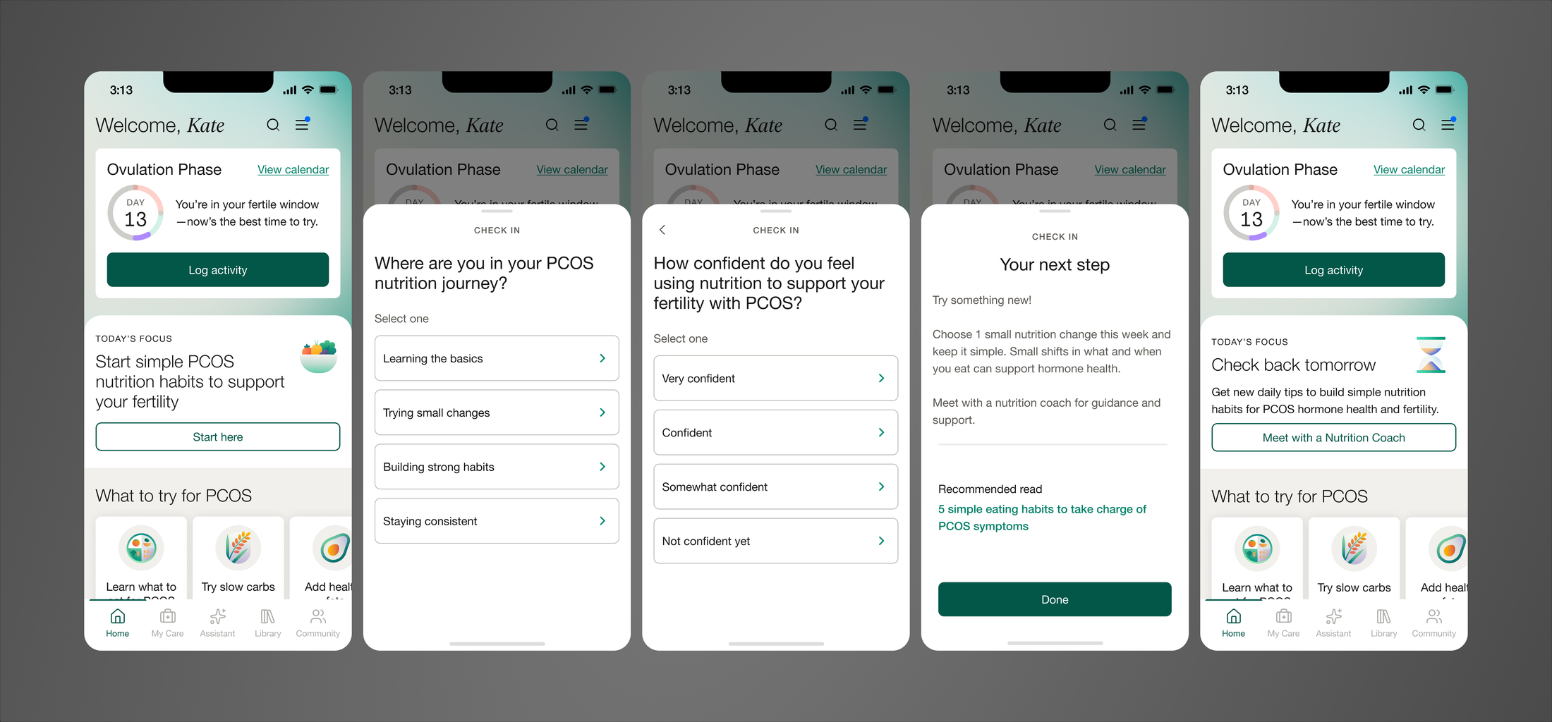
Maven's Fertility experience was largely generic. A user with PCOS and a user with no diagnosis or suspected condition saw the same homepage, even though PCOS has a well-established, treatment-free management lever: nutrition.
For PCOS specifically, dietary changes are one of the most effective non-treatment ways to manage the condition, but Maven wasn't doing anything to help users act on that, or to signal that Maven understood their condition was different from a general fertility case. This module was the first execution of Maven's strategy shift from one-size-fits-all guidance to condition-based care pathways, starting at the homepage. [Read more about Maven's strategy driving this project.]
What I built
The module
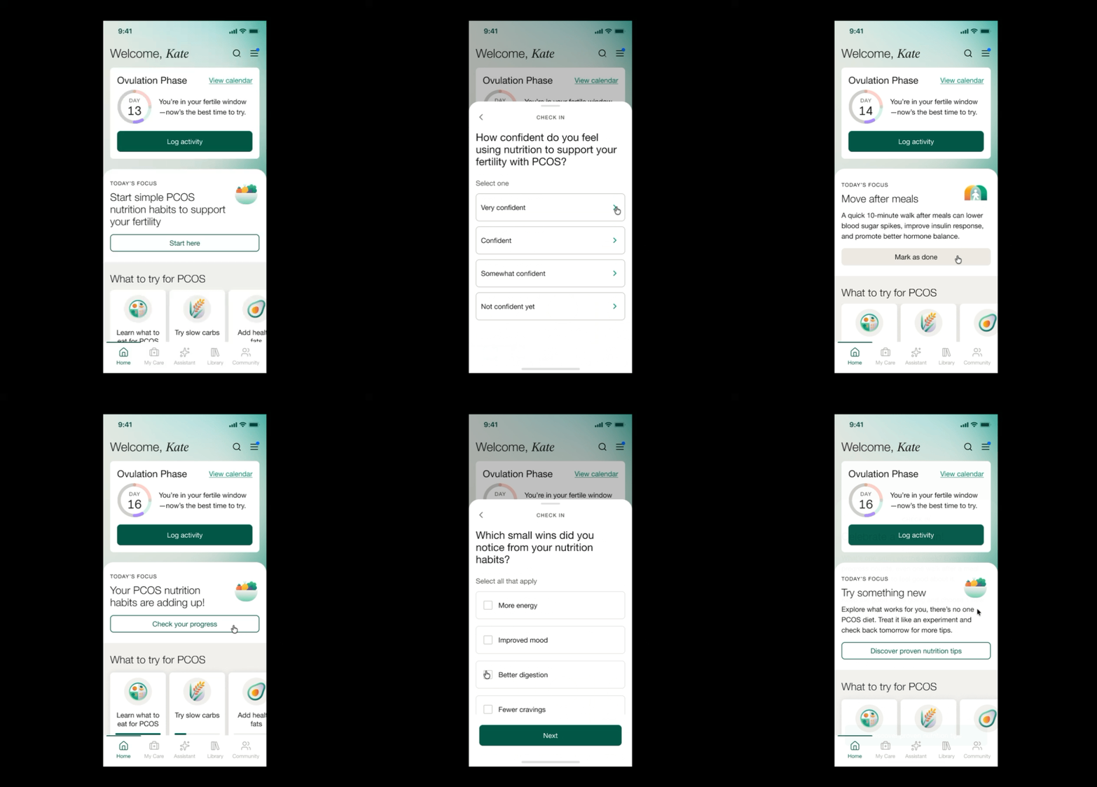
I designed a homepage module that rotated content over a weekly cycle each time a user logged in. Rotations mixed formats deliberately: some days surfaced an assessment question through a bottom sheet, others prompted a loggable behavior (like a short walk after a meal), others delivered supportive or educational content. The goal was to make daily engagement feel varied, while quietly capturing data on what users were doing and how they felt about managing their condition.
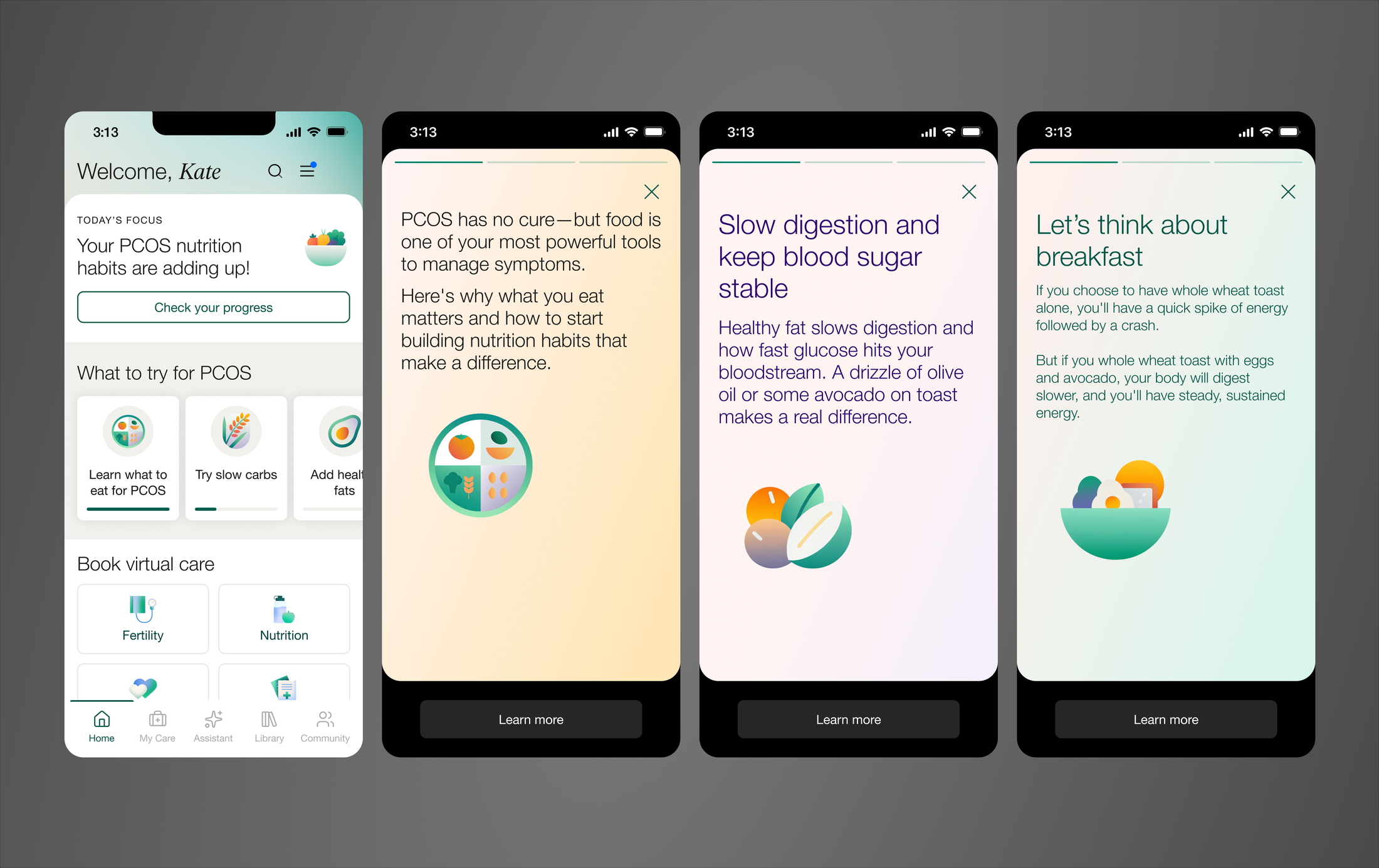
Story-card carousel
Alongside the module, I designed a story-card carousel, an Instagram Stories-style format, with 7 illustrated card sets going deep on individual nutrition topics. This was meant to be a more interactive, higher-retention alternative to a static article for users who wanted to go beyond the daily module.
The hardest part: assessments
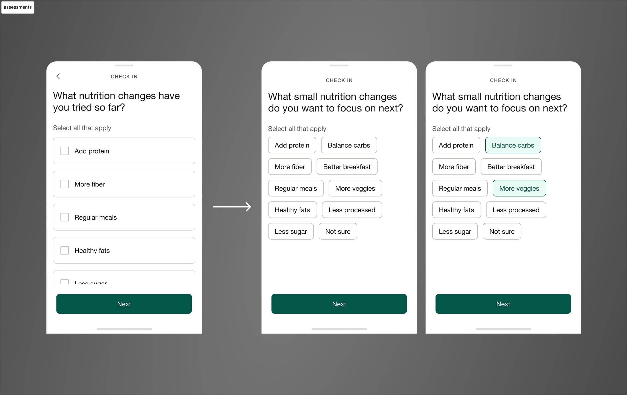
The assessment bottom sheets needed to plug into Maven's existing assessment infrastructure, tightly coupled to legacy backend architecture never built for this use case. I worked closely with engineering to unwind that constraint and find the simplest path to ship without rebuilding the system underneath it.
That tradeoff shaped scope: questions were limited to checkbox/multiselect and radio/single-select formats, and result screens stayed simple. I scoped and proposed a future version of the assessment UI supporting more question types and more visually developed result pages.
A new pattern
I designed a new interaction pattern for activity logging: a “mark as done” button with a distinct completed state, now a reusable pattern in Maven's design system.
Why it mattered beyond this feature
Two things made this bigger than a single feature. First, the module was built as a template, not a one-off, structured to be repurposed for other condition pathways, starting with Endometriosis.
Second, it changed what the top of the Fertility homepage does. Instead of static content, users now see something dynamic, personalized to their condition, and interactive, supporting Maven's broader positioning shift toward condition-specific care.
Prototyping as the primary tool
Static screens couldn't show how this worked. The homepage rotated through different states over a week, assessment sheets, loggable activities, story cards, completed states. I built the whole thing as a working prototype in Figma Make, and it became the source of truth everyone worked from. Engineers and I used it together to work through edge cases and highlight discrepancies between ideal state designs and currently available UI, and Product and stakeholders relied on the same prototype to drive their conversations.
Outcome
This shipped in May 2026, so there's no usage data yet. What it's designed to move: daily engagement with the Fertility homepage for PCOS users, self-reported symptom and behavior data Maven didn't previously have.
On the design side, the concrete outcomes are already real: a new templatized content block now available to other condition pathways, a new button interaction pattern adopted into the design system, and a scoped path forward for a more flexible assessment UI.