Fertility Experience
Maven Clinic
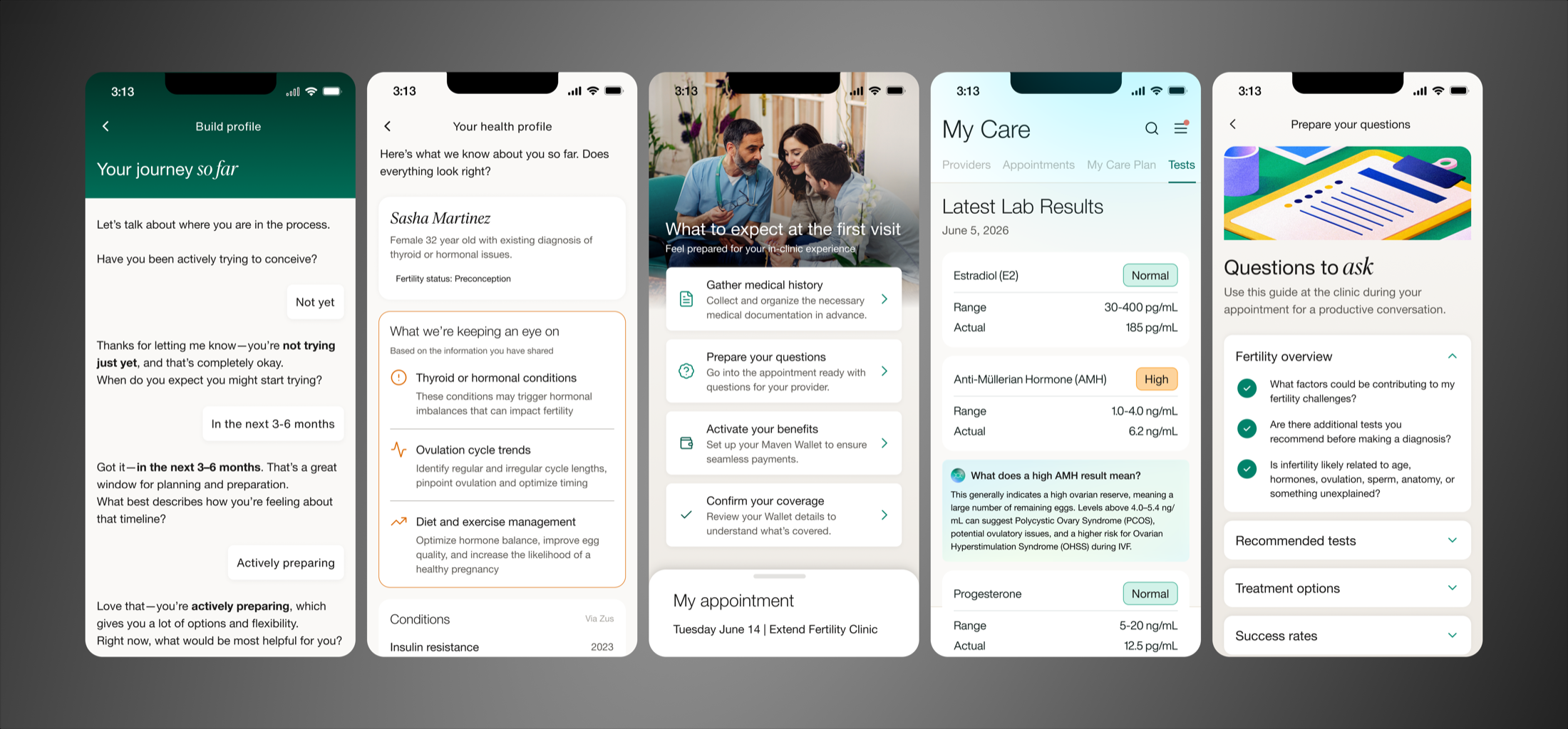
The problem space
Most people trying to conceive don't lack information, they lack access to it at the right moment. Cycle signals go unnoticed because they're buried instead of surfaced. Diagnostic testing defaults to one partner, leaving a major factor unexamined. Conditions that need a different kind of care get routed through a generic fertility path instead of one built for them. [Read Maven's press release]
My work leading design for the fertility experience at Maven focused on closing those specific gaps: surfacing cycle data earlier, replacing single point-in-time testing with continuous signal, and building a path for a condition that doesn't fit the standard model.
Initiative 1: Drive Cycle Tracker adoption & retention
The opportunity
Roughly 30% of Maven's users are in the Fertility population, with Cycle Tracker as the feature that drives the most engagement and retention in this segment.
Cycle Tracker (and the clinical outcomes it can help drive) only works if people log into it. Every unassisted-conception insight, and every downstream support Maven can offer, depends on what a user logs. The opportunity was to create a front and center homepage widget that could convert Fertility users who hadn't onboarded to the feature yet, and give already-onboarded users a reason to keep coming back and logging.
What I designed
This was two product problems in one interface: convert users who hadn't onboarded, retain and drive action for those who had. I designed 12 versions across two tracks, Trying to Conceive and Preconception, each solving for a different moment in the user's relationship with the feature. It shipped on iOS and Android at full fidelity in 2026, with a simplified version for web.
This widget holds the highest-value real estate on the homepage, the top slot every fertility user sees first, which reflects how central Cycle Tracker was meant to be to a user's day-to-day use of the product.
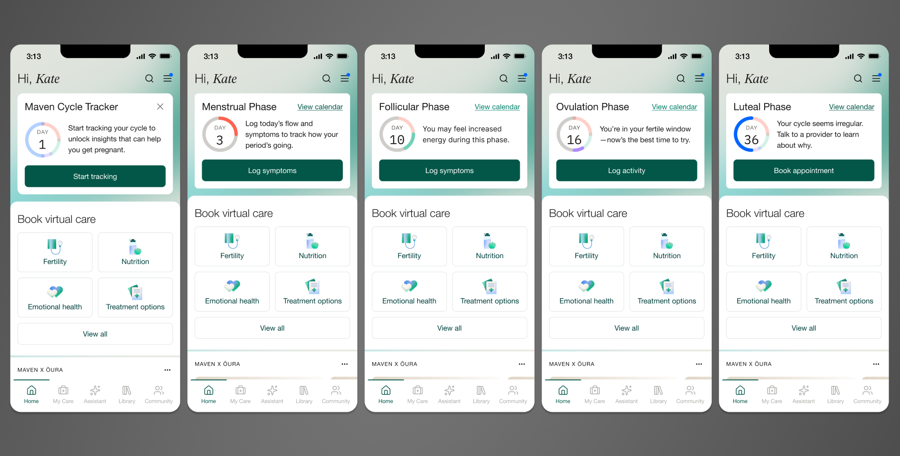
I designed a new card component for Maven's design system, built as a reusable foundation rather than a one-off, and a new way to represent cycle day: a circular indicator that updates as a user moves through their cycle, instead of a static number or date. Copy stayed short and specific by design, enough to earn a click, not fill space.
This widget was designed with intention to give users the "at a glance" view of their cycle day and phase, any time they enter the app. It is not designed to stress them out about their cycle day, especially if the length is irregular. The widget tells them where they are, offers one relevant next step, and lets them move on.
Why it works
The widget does three jobs at once: it teaches users what Cycle Tracker actually does and promotes feature adoption, it gives onboarded users a reason to check in regularly, and it routes them to the most relevant action for where they are in their cycle, driving re-engagement.
Because it lives at the top of the Fertility homepage, it reaches the largest possible share of fertility users without requiring them to seek the feature out.
Impact
The widget took the top position on the Fertility homepage and has held it since launch, continuing to serve as the primary driver of Cycle Tracker engagement and onboarding for the ~30% of Maven users in that program, lifting Cycle Tracker onboarding from 18% to 24% of users.
Initiative 2: Integrate Oura data with Cycle Tracker
The opportunity
Maven partnered with Oura in 2025 to bring wearable data into Cycle Tracker. I designed the reproductive data piece of the integration for users and providers, fully QA'd and awaiting release.
Cycle tracking usually means logging dates. Dates tell you a period started, not whether ovulation happened, and ovulation is what matters for conception. Oura already had FDA-approved ovulation data. It just wasn't connected to a fertility care experience. This integration puts it in front of users and care teams, giving both a real signal for figuring out what's blocking conception.
What I designed
This was a partnership project, which meant designing inside someone else's constraints as much as my own. I worked directly with Oura's Product, Design, Legal, and Compliance teams, alongside my Product and Engineering colleagues, to figure out how their data could live inside Maven's product without compromising either company's standards.
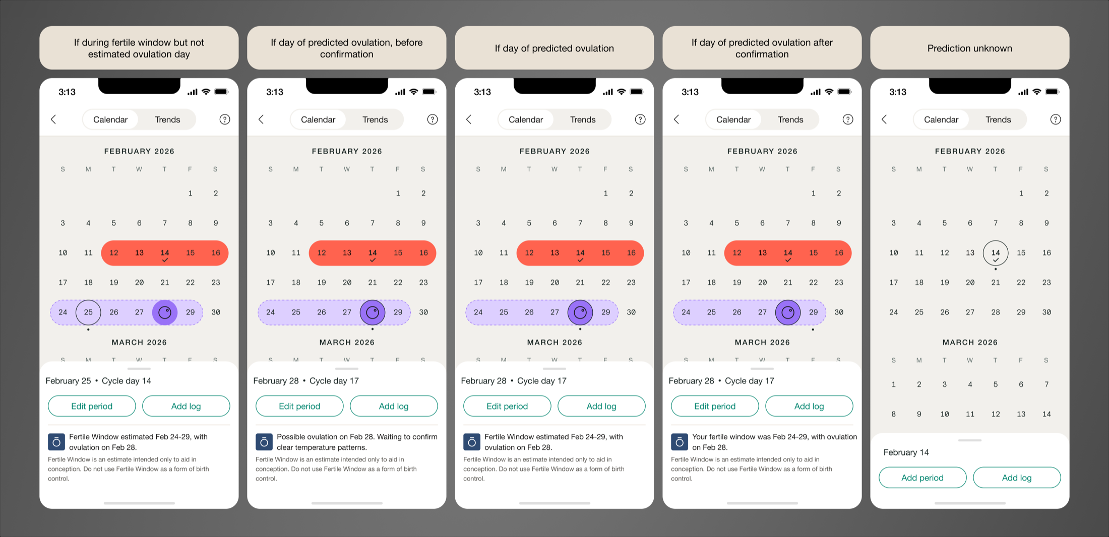
I made ovulation status unambiguous across the product: Fertile Window, Predicted Ovulation, and Confirmed Ovulation each got clear icons, plain-language explanations, and visible Oura sourcing, all fitted into Maven's existing design system rather than a full redesign. Because these were new concepts, I validated comprehension directly: all 20 users tested interpreted them correctly.
From there, I extended the work across the full experience: rebuilt settings to handle the new controls, brought the same data visualization into Maven's EMR so providers see what their patients see, and designed the promotional moments across the app that introduced the integration to users who hadn't connected yet.
Accuracy and sign-off
Cycle Tracker already pulls from multiple sources: user-logged symptoms, Apple Health, and now Oura. I partnered closely with backend engineering to define how conflicting data between sources would be resolved and data would be clearly visualized so users wouldn't see contradictory information.
Every part of the design had to meet the bar Oura needed to feel comfortable putting their name on the release, so I presented the work to their team for multiple rounds of feedback and approval.
Status
The integration is fully built and QA'd, awaiting release, so outcome data isn't available yet. The targets going in: a 20% increase in ovulation-confirmation tool usage, and a contribution toward Maven's broader 32% unassisted conception rate among fertility users.
Initiative 3: Promote diagnostic testing
The opportunity
Maven partnered with Fellow, a company that provides at-home semen analysis kits, to close a gap in male fertility testing. I designed the Fertility experience that introduced it and moved men through testing, shipped to production across all platforms in late 2025.
Nearly 50% of infertility cases involve a male factor, but stigma keeps testing rates low. Delayed diagnosis shifts the burden onto the female partner by default. Fellow removed the clinical friction. Maven still needed to make men aware, comfortable enough to act, and give female partners a way to raise it without friction.
What I designed
I built two paths into the same offering, since the person discovering it and the person completing it aren't always the same user.
For male users: a flow to learn about the Fellow offering and move straight into ordering the kit, designed to lower the barrier of a topic men are often reluctant to engage with at all.
For female fertility users: a parallel flow to learn about the offering and share it with a male partner, so testing could be introduced by someone already inside the Maven experience instead of requiring the partner to seek it out cold.
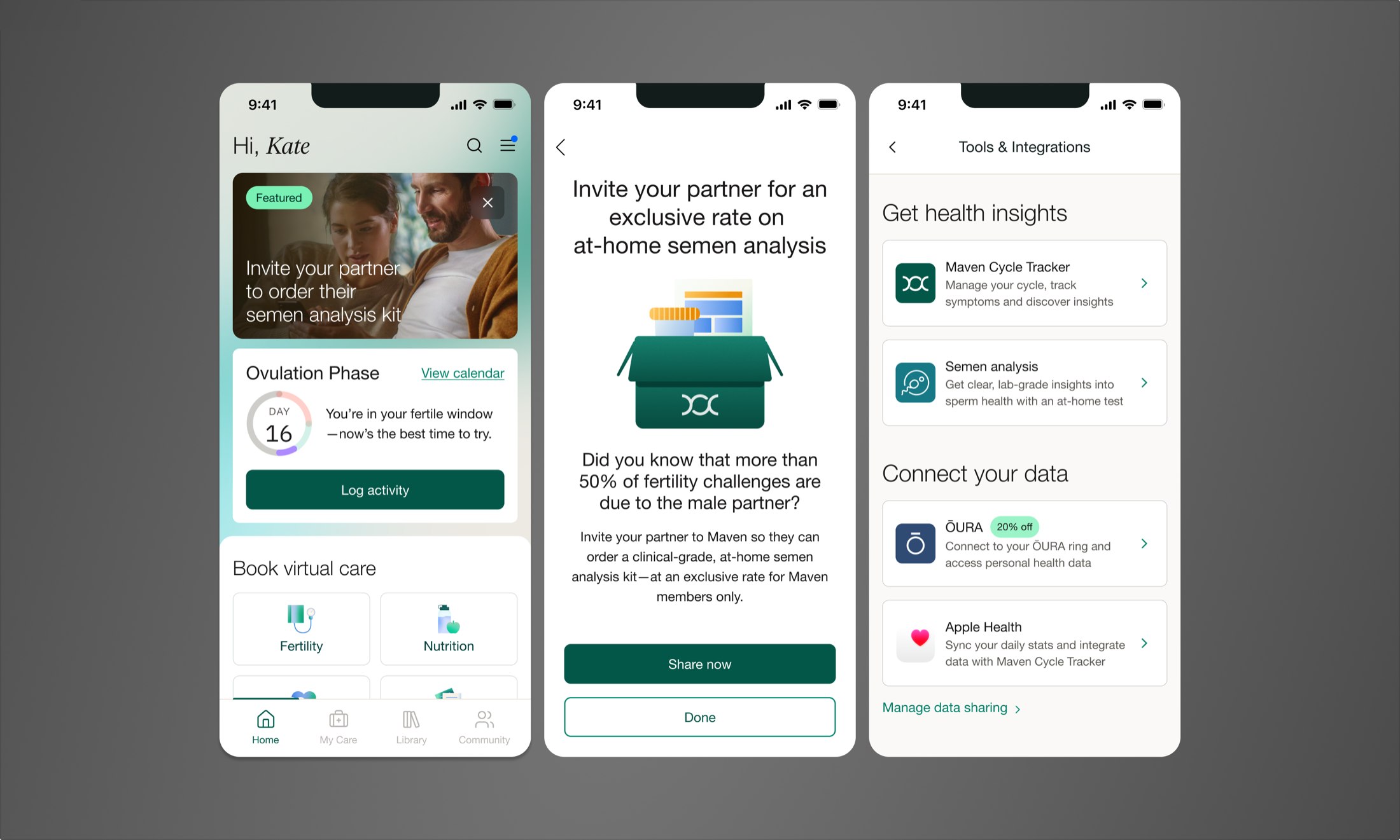
The centerpiece of the work was a new homepage content unit I created called the Featured Action Card. It sits at the top of the fertility homepage, the same high-value real estate reserved for the most important actions we needed users to take. Given how much resistance exists around this specific topic, the card had to do more than inform, it had to capture attention and create enough urgency to move someone from awareness to action.
Beyond the features: a living prototype
Beyond shipping these features, I built the first functional prototype of the entire Fertility homepage experience in Claude Code. It included a configurable control panel so product, engineering, and business stakeholders could see a real, 1:1 view of any user state.
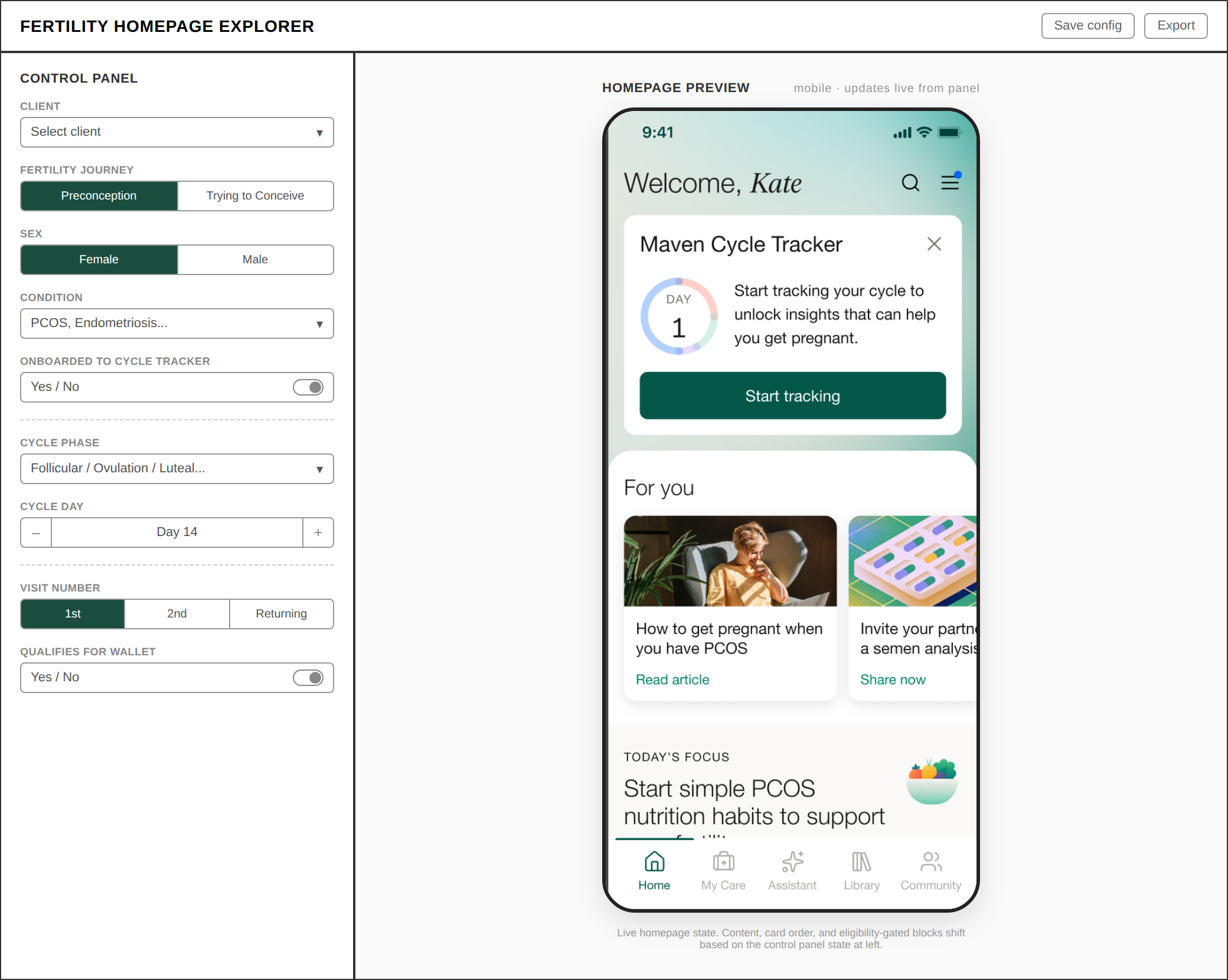
I set it up as a project in the design team's GitHub repository and kept it updated, so other designers could pull it down and build from it instead of starting from scratch. This helped tie all these projects together into a cohesive fertility homepage experience and strategy.