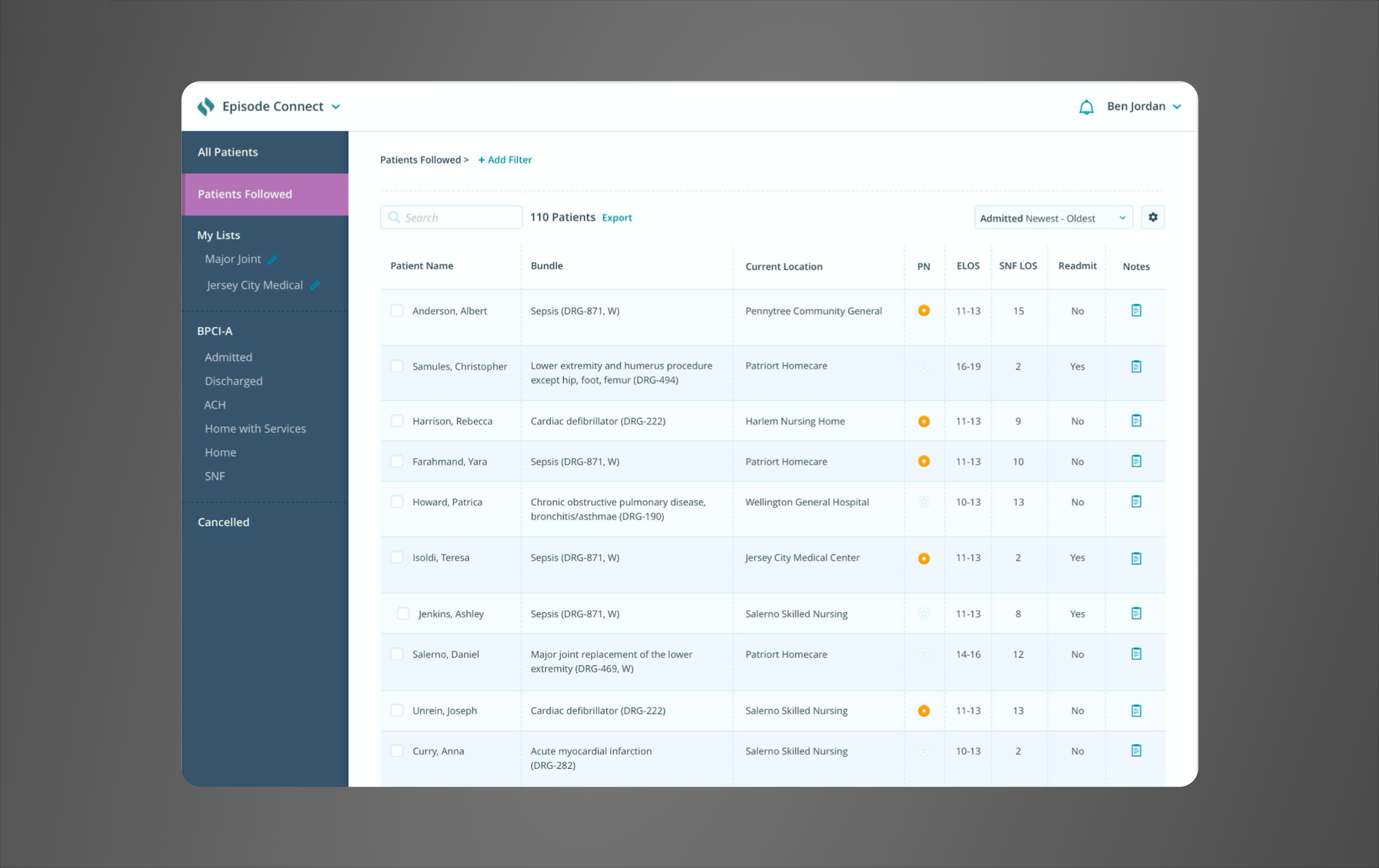
Patients Followed
Signify Health
Context
Signify Health managed 90-day episodes of care for health systems and hospitals, taking on financial risk for the total cost of each patient's episode. Length of stay and readmissions weren't just clinical metrics - they were the difference between an episode coming in under budget or over it.
The operations team responsible for tracking this in real time wasn't using Signify's own product to do it. They were using their own handmade Excel workflow.
The problem
Episode Connect, Signify's B2B product, was supposed to be the system of record for all parties involved managing and tracking patients. In practice, users tracked their patients in an Excel spreadsheet and copied the data in after the fact, if they got to it at all.
Leadership had built a standard template for the team to use as part of that workflow, but it didn't hold. By the time my team got involved, almost no two people's sheets looked the same. People had forked it, added their own columns, built their own logic for flagging patients they were worried about. Some were sharing these personal versions with managers because they'd become more useful than the actual product.
The spreadsheet was the real tool and source of truth. My job was to figure out what the spreadsheet was actually doing for them, and bring that back into the product we owned.
Research
I ran discovery sessions with a chunk of the 50-person team, then surveyed everyone to get harder data on how people were actually working, what they tracked, how they formatted it, where it broke down.
One thing came back clearly. When I asked people to rank what mattered most, almost everyone landed on the same order:
- current length of stay
- current facility
- notes from facility conversations
- anticipated discharge
- a few other fields further down the list
That ranking became the spec and helped drive the feature prioritization order.
Design
I designed early iterations, then brought them back to the same users I'd interviewed for feedback, more than once, as the design evolved. That's how the entry point changed. My first version had people follow a patient only from their profile. Users wanted it available from wherever they were already working, so I moved it there.
I looked at flexible data-grid tools as a reference point for the table itself, since that kind of sorting and filtering was close to what people had already built for themselves informally and we didn't necessarily have to do it all from scratch.
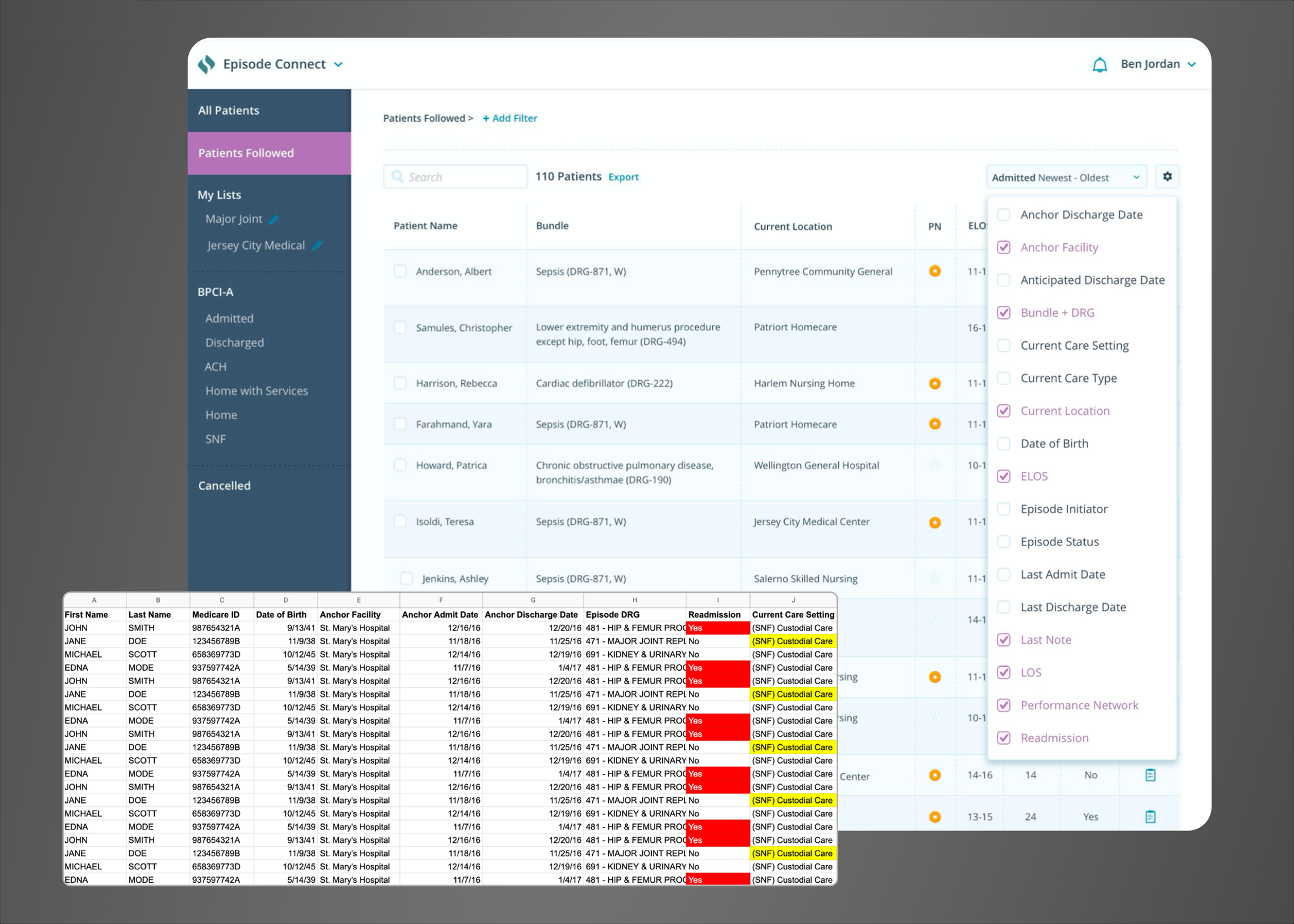
The final design included:
- A new dedicated "Patients Followed" view, so people only saw the patients they were personally tracking, not the full list of all patients in the system
- A way to follow a patient from wherever they encountered them in the product, instead of a separate step
- The filtering fields that came out as highest priority from the research, plus a one-click link to a patient's latest note without having to dig all the way into their history
- A path from any row into the full patient profile, so this stayed a fast check-in, not a copy of the profile
The design challenge I faced was deciding what didn't need to be part of the feature itself. Users had years of personal logic built into their sheets that didn't necessarily warrant being built into a product. I held the line at what research told me actually mattered for the majority of users, which meant telling a few people their specific workaround wasn't making it into the build.
Outcome
The spreadsheet was fully sunset. Internal operations teams moved their workflow following patients into Episode Connect and stayed there.
In follow-up conversations, users reported that the Patients Followed feature helped them better be able to:
- Track patients by facility ahead of facility meetings
- See at a glance where a patient currently was, especially after a readmission
- Get to a patient's latest note in one click instead of digging through their profile
- Clean up their list as patients were discharged or moved off their caseload